Voters in the 2017 general election – and how they voted previously

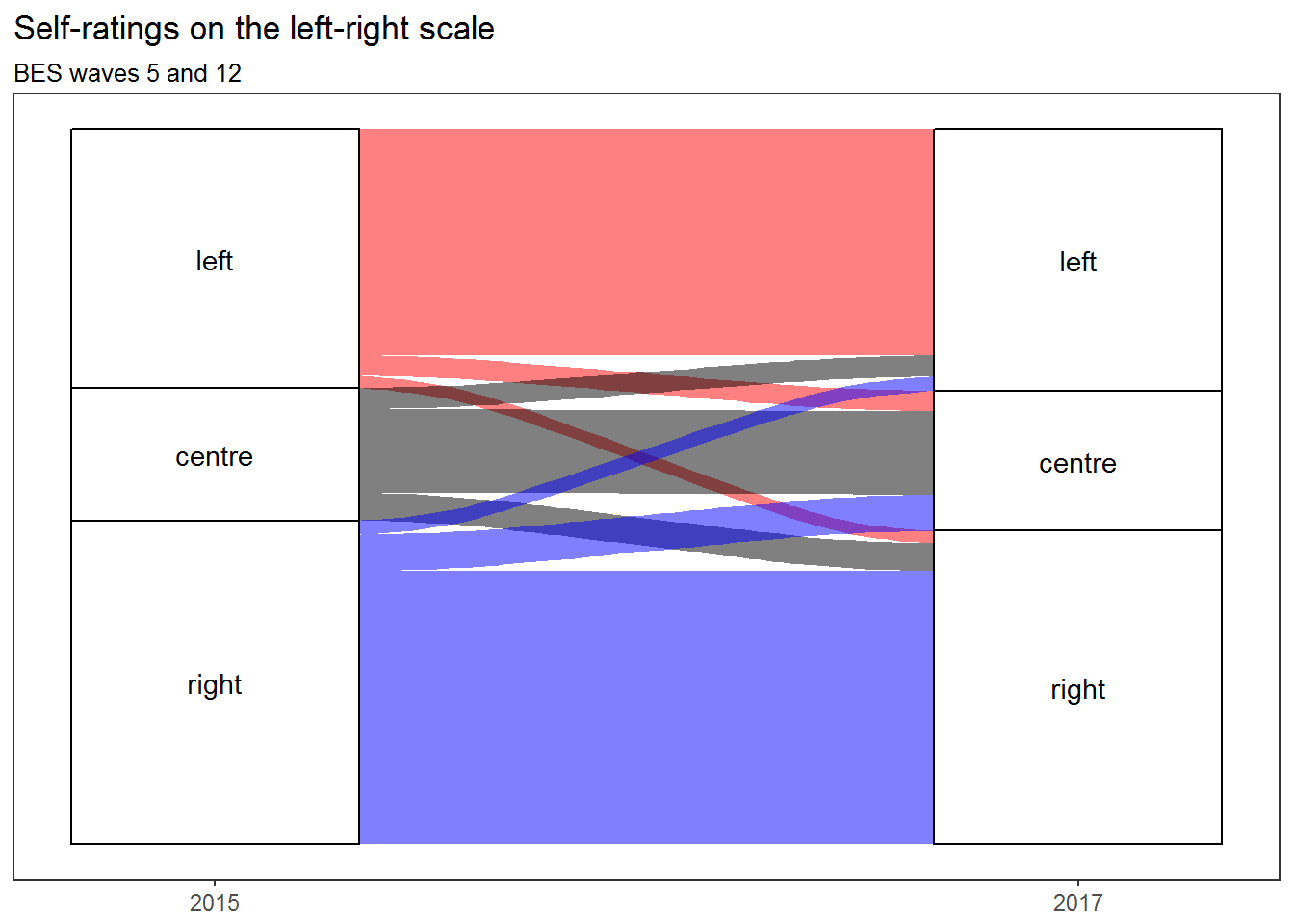
This is the third and final part of my preliminary analysis of groups of voters defined by the choices they made in the 2015 general election, the 2016 European Union membership referendum, and the 2017 general election (c.f. Stephen Bush’s nine voter groups), using an English subset of responses to the British Election Study’s post-election face-to-face survey. In the first part, I looked at the ten largest groups, from Conservative-Leave-Conservative to Conservative-Remain-Labour, both in terms of their size and in terms of their self-declared likelihood to vote for various parties in future, and found that Labour Remainers were not only more numerous but (on their own assessment) more likely to be poached than Labour Leavers, while the smaller group of Conservative Remainers who had switched to voting Labour were quite likely to switch again. In the second part, I looked at six groups of voters who had in common that they could have voted but did not in the 2015 general election, finding that most of them did not vote either in the 2016 referendum or the 2017 general election, and that only the minority who voted Remain in the 2016 referendum were more likely than not to have voted in the 2017 general election.

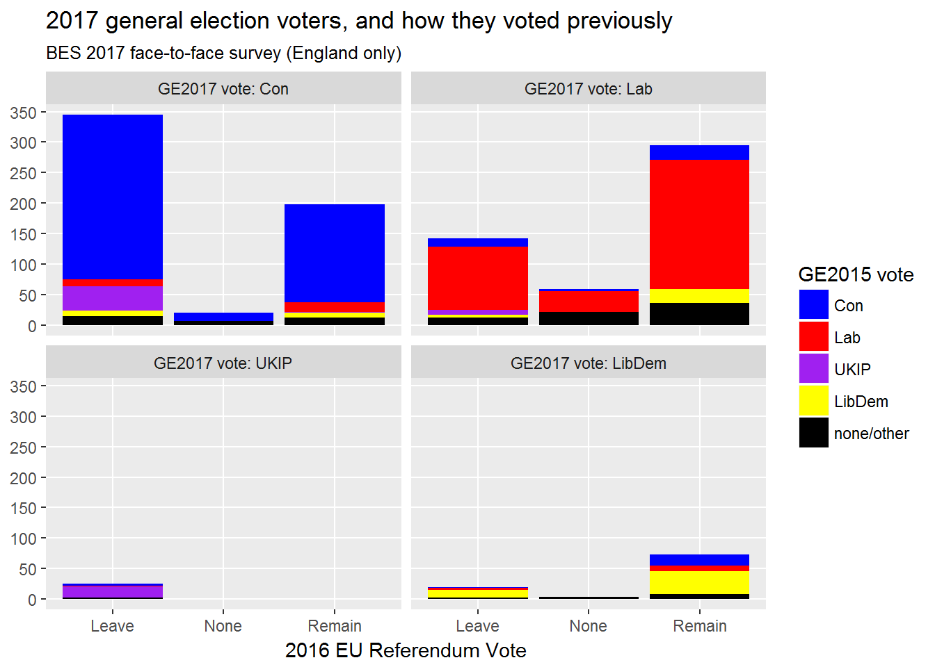
To finish up for now, here’s a single chart showing all voter groups which participated in the 2017 general election (weighted by demographic group and by 2017 vote). Each quarter of the chart below shows the members of the sample who voted for one of the four main parties. These voters are further subdivided into columns to show how they voted in the referendum and into coloured blocks to show who they voted for in 2015 (note that black covers both non-voting and voting outside the four main parties, which most often meant voting Green as the data are from England only):

Voters in the 2017 general election - and how they voted previously

Continue reading “Voters in the 2017 general election – and how they voted previously”

Ten voter groups: combinations of EU referendum and general election votes in the BES 2017 face-to-face survey

Like many, I read with interest Stephen Bush’s recent article on ‘The nine voter groups who are more important than Labour Leavers’. If Bush were a grant awarding institution, there would be money available for researching those groups. Well, he isn’t, so there isn’t, but I like a challenge so I’m going to make a start anyway – using open data from the British Election Study (henceforth, BES). To be more specific, I’ll be using the BES 2017 face-to-face survey, which was conducted after the election and uses what should probably be considered a more genuinely random sample than the online waves.

Continue reading “Ten voter groups: combinations of EU referendum and general election votes in the BES 2017 face-to-face survey”

The leftward-marching Labour Party and the unmoving British electorate

Last year, I did some analysis of how respondents to surveys carried out as part of the British Election Study placed themselves and the main British political parties on a left-right scale. This suggested that, despite what the election results might lead one to expect, there appeared to be no leftward shift amongst voters between the 2015 and 2017 general elections, although there was a strong leftward shift in their perceptions of the Labour Party. One thing I couldn’t explore using the type of analysis and visualisation I carried out there is whether the same people were identifying themselves and the two main parties with the Left, the Right, and the Centre, or whether it was different people but in similar numbers. Because the BES is a longitudinal study, repeatedly surveying the same individuals (so far as is possible), we can reasonably ask this question. But how can we answer it? One way is by using alluvial diagrams, a form of visualisation developed in order to visualise change over time. (If you want to know how to make your own, there’s a guide to creating alluvial diagrams with R in the longer version of this article.)

Self-ratings on the left-right political scale in BES waves 5 and 12

This alluvial diagram shows that people tended to give the same answers in 2015 and 2017, and that any movement tended to be balanced by approximately equal movement in the other direction, except in that there was more movement from the Right to the Centre than from the Centre to the Right (despite which, the Right remained larger than the Left overall). This supports the view that there was no leftwards shift on the part of the electorate between 2015 and 2017. But what about the major parties?

Continue reading “The leftward-marching Labour Party and the unmoving British electorate”

The unnoticed rise of the centrist voter (and what it means for Labour)

Centrist dads, eh? (And presumably also centrist mums, although abusing them on behalf of the Absolute Boy might sound less like striking a feminist blow against patriarchy.) How wrong they were! They were so sure that Labour was going to lose the election, when as everyone now knows… well, actually, Labour did lose, but never mind — the centrists were still wrong. Slugs! By refusing to compromise on his left wing principles, Jeremy Corbyn shifted the Overton Window, opened up some clear red water between Labour and the Tories, and flipped social liberals for Socialism. In losing the election by a mere 55 seats out of a possible 650, he achieved total vindication for his strategy, and proved that he only has to do more of the same in order to find himself at the head of the Government after the next election (unlike — say — Gordon Brown, who lost by 48 seats and resigned, the melt). Onward, comrades! Onward to Socialism!

Now, I don’t believe that many people primarily choose whether or not to vote for a party to vote on the basis of how ‘left’ or ‘right’ they believe it to be. But ideas of leftness and rightness provide people with a way of summarising their relationships with political parties, and for this reason, I think it’s worth paying attention to the answers they give to survey questions about where they place themselves and the major parties on the left-right spectrum. And so we come to waves 5 and 12 of the British Election Study (or BES), in which a staggering 30725 and 34464 respondents took part immediately prior to the UK General Elections of 2015 and 2017. In the following chart, based on BES data, the grey areas show how people identified themselves, while the red and blue lines show how they typically situated the Labour Party and the Conservative Party on the same axis (respectively).1

l-r-ident-plus-median-parties

Continue reading “The unnoticed rise of the centrist voter (and what it means for Labour)”

The left, the right, the centre – and what they care about most

Why did people vote as they did in the June 2017 UK general election, and how might they vote in the next one — whenever it comes? One of the best sources of information on that question is wave 13 of the British Election Study: a very large survey conducted just after the election for a consortium of academics at the University of Manchester, the University of Oxford, and the University of Nottingham. Altogether 31196 respondents completed the survey, of whom 27019 (after weighting) answered the question ‘As far as you’re concerned, what is the SINGLE MOST important issue facing the country at the present time?’ and 23194 (again after weighting) identified themselves politically by positioning themselves on an eleven point scale from left to right. 21213 both placed themselves on the scale and gave their view on the most important issue. I’ve been working with this dataset for a little while, looking at how demographic variables predict perceptions of the most important issue (see my earlier post for my initial exploration of this topic), but here I’d like to focus on the association of particular issues with particular positions on the political spectrum:

mii-by-left-right-w13

Continue reading “The left, the right, the centre – and what they care about most”

Who won the Twitter election? Part ii: ‘faithful’ and ‘promiscuous’ followers

Last month, I published an analysis of candidates’ public Twitter followers immediately before the General Election. As I showed, Conservative candidates tended to have more public followers than Labour candidates — but once we control for whether candidates had or had not previously been Members of Parliament, we find that Labour candidates tended to have more public followers than Conservative candidates. SNP candidates tended to have more public followers than Conservative or Labour candidates, although that finding was not statistically significant after controls because of the low numbers involved.

This does not, however, address the question of which party’s candidates had more public followers in total — nor the much more subtle question of how many of each party’s candidates’ public followers exclusively followed candidates of that party, and how many also followed candidates of other parties. To answer that question, we need to know who the candidates’ followers were. Fortunately, I do:

Total public Twitter followers of all candidates in the 2017 General Election, showing how many followed each party's candidates exclusively (solid colour) and how many also followed the candidates of one or more additional parties (transparent)
Total public Twitter followers of all candidates in the 2017 General Election, showing how many followed each party’s candidates exclusively (solid colour) and how many also followed the candidates of one or more additional parties (transparent)

Continue reading “Who won the Twitter election? Part ii: ‘faithful’ and ‘promiscuous’ followers”

Who won the Twitter election? Part i: followers, and which party’s candidates tended to have more of them

Just over half a year ago, the Telegraph carried out an analysis appearing to show that ‘the Labour leader’s shadow cabinet d[id]n’t have as wide a reach as their opposite numbers on Twitter’. This conclusion was arrived at by comparing ministers and shadow ministers whose roles were directly parallel: ‘[Jeremy] Corbyn has more followers than Theresa May, while Diane Abbott saw off Amber Rudd, John McDonnell beat Philip Hammond and Keir Starmer edged out David Davis’, but with regard to the others, ‘the Government enjoyed a clean sweep of the board’ (ibid.).

This is interesting, but I don’t find it satisfactory. The Conservative Party’s best known and most popular politicians were mostly in the cabinet. But while Corbyn himself remains the Labour Party’s biggest social media star, its second- and fourth-most popular MPs on Twitter were and are excluded from the shadow cabinet by virtue of not being Corbyn loyalists, while the third-most popular has technically remained a shadow cabinet member but was excluded from the Telegraph’s analysis by virtue of having no Tory opposite number.

So what happens if we look at the public followers of all prospective parliamentary candidates? This happens. (Figures collected in the week before the General Election for a different purpose and re-used here. Small parties excluded. If you want code, here’s my notebook. Hat tip to Democracy Club for its crowdsourced list of politicians’ social media accounts.)

Twitter following by party, GE 2017

Continue reading “Who won the Twitter election? Part i: followers, and which party’s candidates tended to have more of them”