Last year, I did some analysis of how respondents to surveys carried out as part of the British Election Study placed themselves and the main British political parties on a left-right scale. This suggested that, despite what the election results might lead one to expect, there appeared to be no leftward shift amongst voters between the 2015 and 2017 general elections, although there was a strong leftward shift in their perceptions of the Labour Party. One thing I couldn’t explore using the type of analysis and visualisation I carried out there is whether the same people were identifying themselves and the two main parties with the Left, the Right, and the Centre, or whether it was different people but in similar numbers. Because the BES is a longitudinal study, repeatedly surveying the same individuals (so far as is possible), we can reasonably ask this question. But how can we answer it? One way is by using alluvial diagrams, a form of visualisation developed in order to visualise change over time. (If you want to know how to make your own, there’s a guide to creating alluvial diagrams with R in the longer version of this article.)
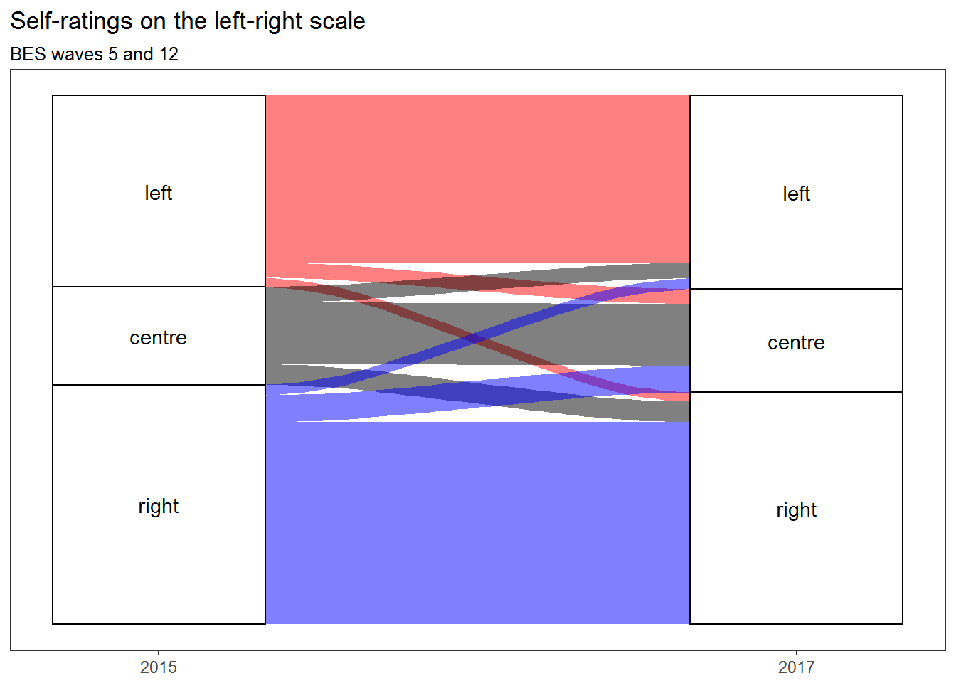
This alluvial diagram shows that people tended to give the same answers in 2015 and 2017, and that any movement tended to be balanced by approximately equal movement in the other direction, except in that there was more movement from the Right to the Centre than from the Centre to the Right (despite which, the Right remained larger than the Left overall). This supports the view that there was no leftwards shift on the part of the electorate between 2015 and 2017. But what about the major parties?
I could simply repeat the same procedure using people’s ratings of the parties instead of their ratings of themselves. But that won’t reveal much: both in 2015 and in 2017, most people agreed that the Labour Party was on the Left and that the Conservative Party was on the Right. So I’m going to do something more subtle. I’m going to find out whether each respondent considered each party to be more left wing than him- or herself, more right wing than him- or herself, or about the same. This wasn’t a question that the BES asked directly, but that’s okay because I can compare each person’s self-rating with his/her rating of each of the main parties and see what they are relative to one another. Then I’ll look for changes in those relative ratings.
Why do this? Because it has been suggested that the Conservative Party has moved to the Right, and that the Labour Party has moved to the Left, but it has also been suggested that the Labour Party’s election campaign succeeded by persuading voters that Socialism is the new Centre. So let’s see if any of these suggestions is borne out by the data, beginning with the Conservatives.
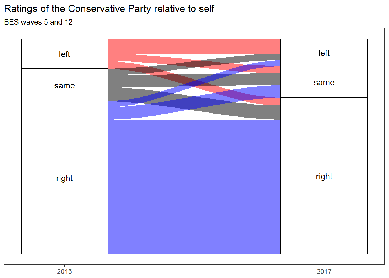
No real change there, so let’s take a look at Labour:
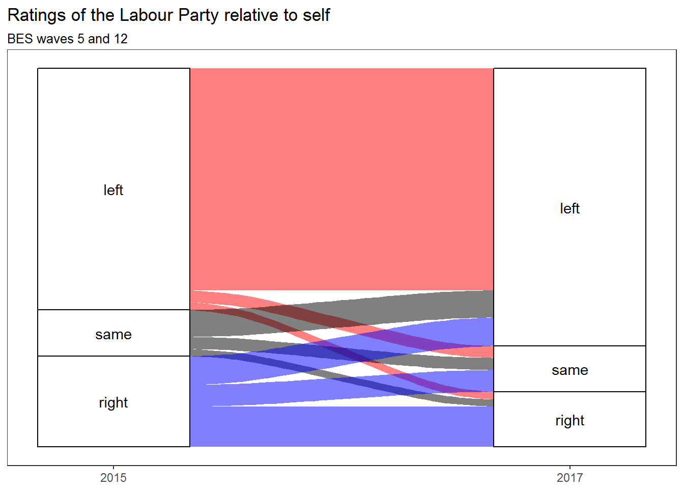
And there’s our shift. About as many people gave the Labour Party the same rating as themselves in 2017 as in 2015. But — and this is what the alluvial diagram shows us — they are not the same people. Those who gave it the same rating as themselves in 2017 are, for the most part, people who previously saw it as to the right of themselves. And those who gave it the same rating as themselves in 2015 had mostly come, by 2017, to see it as being to their left — as had an even greater number of those who previously saw it as being to their right. Whatever voters think ‘left’ and ‘right’ mean, it’s a sign that Labour is not carrying them with it on its much-trumpeted leftward march.
Note that this doesn’t just mean that people saw Labour as having moved leftward. In itself, that wouldn’t be a problem. What it means is, rather, that substantial numbers of people who used to see Labour as representing a position that was in accordance with their own views, or perhaps even as not being quite Left enough, now see themselves as standing to its right.
And that should worry Labour. Voters who see themselves as standing between the two major parties are open to being poached from the party they usually vote for. And the more they see the party they usually vote for as a home for the sort of cranks who think that putting Star of David earrings on a photograph of Theresa May is a good way of discouraging people from voting for her, the better they’re going to feel about letting themselves be poached.
Technical note
To create these visualisations, I used the R programming language and the ggalluvial package. If you are interested, you can download a notebook containing my code, tables showing the actual figures, and an earlier draft of this blog post (which includes a lot more explanation of what I did and why, as well as a how-to). For a more comprehensive but probably less beginner-friendly introduction to ggalluvial, see the tutorial by its creator, Jason Cory Brunson. If you don’t use R and you’re curious to know what there might be in it for you, I published an essay explaining why I now do all my quants work in it last month.