Last year, I did some analysis of how respondents to surveys carried out as part of the British Election Study placed themselves and the main British political parties on a left-right scale. This suggested that, despite what the election results might lead one to expect, there appeared to be no leftward shift amongst voters between the 2015 and 2017 general elections, although there was a strong leftward shift in their perceptions of the Labour Party. One thing I couldn’t explore using the type of analysis and visualisation I carried out there is whether the same people were identifying themselves and the two main parties with the Left, the Right, and the Centre, or whether it was different people but in similar numbers. Because the BES is a longitudinal study, repeatedly surveying the same individuals (so far as is possible), we can reasonably ask this question. But how can we answer it? One way is by using alluvial diagrams, a form of visualisation developed in order to visualise change over time. (If you want to know how to make your own, there’s a guide to creating alluvial diagrams with R in the longer version of this article.)

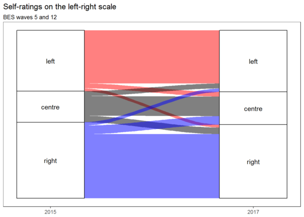
This alluvial diagram shows that people tended to give the same answers in 2015 and 2017, and that any movement tended to be balanced by approximately equal movement in the other direction, except in that there was more movement from the Right to the Centre than from the Centre to the Right (despite which, the Right remained larger than the Left overall). This supports the view that there was no leftwards shift on the part of the electorate between 2015 and 2017. But what about the major parties?
Continue reading “The leftward-marching Labour Party and the unmoving British electorate”