I recently started to do some work with NSS (National Student Survey) data, which are available from the HEFCE website in the form of Excel workbooks. To get the data I wanted, I started copying and pasting, but I quickly realised how hard it was going to be to be sure that I hadn’t made any mistakes. (Full disclosure: it turns out that actually I did make some mistakes, e.g. once I left out an entire row because I hadn’t noticed that it wasn’t selected.) Using a programming language such as R to create a script to import data requires much more of an investment of time upfront than diving straight in and beginning to copy and paste but the payoff is that once your script works, you can use it over and over again – which is why I now have several years’ worth of NSS data covering all courses and institutions, from which I can quite easily pull out whichever numbers I want using a dplyr filter statement (as long as I am prepared to take account of irregularities e.g. in institutions’ names from one year to the next – which would also be necessary when doing things by point-and-click).
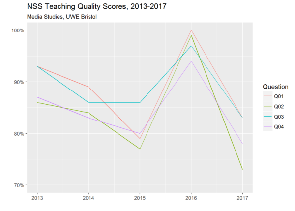
For example, looking at how all institutions performed in my particular discipline with regard to the four NSS questions relating to teaching quality, I can see that Media Studies at the University of the West of England managed the quite remarkable feat of rising from 68th place in 2015 to 2nd place in 2016 before falling back to 53rd place in 2017. To visualise only these four questions in relation to this subject at this institution over the whole time period for which I have data, I can filter out everything relating to other disciplines and other institutions with a single statement, and then use ggplot to represent each of the four variables that I’m interested in with a different coloured line:

How could such a dramatic rise and fall occur? Maybe someone who still works at UWE would be better placed to explain. But the general question of what drives student perceptions of teaching quality is one that I’m interested to explore as a researcher – and I’ll be posting thoughts and findings here as and when.
In the meantime, here’s my code, presented as an example of how the automation of error-prone tasks can take some of the uncertainty out of the research process. You probably aren’t interested in working with this particular dataset, but you may have other datasets that you would like to deal with in the same way. Yes, it looks complicated if you’re not used to scripting – but the code is actually quite simple, and the thing is that I was able to build it up iteratively, by adding statements, running the script as a whole, noticing what went wrong, and then fixing whatever it was, one step at a time. (The code is very heavily commented, to give a non-coder an idea of what those steps were and what sort of thinking is typically involved in taking a code-based rather than point-and-click-based approach to data importing etc.)