Over the last few months, I’ve often heard that polls can’t be trusted. In particular, I have heard that they can’t be trusted because each one usually involves study of only about a thousand individuals. I have even heard that argument from a retired quantitative linguist.1 So I’ve put together this essay in order to explain how polls work, why a random sample of a thousand should usually be considered sufficient, and why the results should be treated as informative even though they do not enable us to predict precise numbers of votes (which is a particular problem when the results are going to be close — because then, precise numbers can make all the difference).
The distinction between polling and prediction is an important one. Polling is a research method, which is why I take an interest in it: I do not teach political science, but I do teach research methods. By general agreement, polling is not just a method, but probably the best available method for estimating public opinion.
Estimates of public opinion provide a basis on which to predict the outcome of a vote, but they do not in themselves predict the vote. Such estimates are inherently imprecise, and this is something that I shall have much to say about below. Moreover, public opinion may be estimated accurately at some particular point in time yet lead to an inaccurate prediction with regard to a future vote. Because public opinion changes all the time, it may change between the time when a poll was conducted and the time when the vote takes place. And public opinion does not necessarily translate into votes in a straightforward way, because not everybody with an opinion will get around to casting a vote.
All this means that the only way to know the vote is to have the election. But for all sorts of reasons, organisations want to know how elections are likely to turn out, and so they turn to polls — and to increasingly elaborate attempts to analyse polls — for the sake of prediction.
It’s really important to understand that clients commission polls in order to acquire information about public opinion. Opinion polling is one of several kinds of social research that are conducted outside the academy, in the private sector. Others include market research, which is often carried out by the same companies. Reputable polling and market research companies compete with one another to provide the most accurate estimates and predictions. They don’t just tell their clients what their clients want to hear, because if they did, their businesses would fail. Success for a pollster depends upon reputation, and a pollster’s reputation suffers when that pollster is seen to have provided misleading information.
Polling works as follows. You want to know what the members of a particular population think, but you can’t ask all of them. Instead, you pick a sample of the population, and you ask members of the sample. The sample needs to be small enough to be cost-effective, but it also needs to be representative of the population as a whole. Regardless of how enormous that population is, you can usually get a somewhat representative sample by picking about a thousand of its members at random.
I wrote this essay to explain why that is the case. There are currently two versions of it: one on my blog, with text and images but without code, and one self-contained R Notebook, with text, images, and code. The explanation of basic principles is followed by a survey of some recent events widely regarded as polling failures, both to show how these things work out in the real world and to explain why recent experience doesn’t entitle anyone to wish away a series of bad polls. I finish up by taking a look at a series of really, really bad polls to show what bad looks like. (Bad, that is, for the losing party — from the point of view of its main rival, those same polls look absolutely great.)
1 A simple polling simulation
To understand how (and why) random sample polling works, we’re going to look at a simulation. We will start with two hypothetical voting populations, A and B. Each consists of a million voters whose preferences are divided between the Sensible Party and the Silly Party. In Population A, 51% of voters support the Sensible Party and 49% support the Silly Party. In Population B, 70% of voters support the Sensible Party and 30% support the Silly Party. (In case you missed it, this is a Monty Python reference. Sorry; I’m British.2)

How can we find out what the members of our two populations think about the two parties? In reality, we’d have to contact them and persuade them to tell us, but this is a simulation, so we only need to write a function to pick random individuals from a population and record their voting preferences. To test it, let’s sample the whole of each population.
| Sensible | Silly | |
|---|---|---|
| A | 51 | 49 |
| B | 70 | 30 |
The perfect result (obviously!), but this is daft: there’s no point sampling people at random if we’re going to sample all of them anyway. So how many people are we going to sample?
1.1 Single polls with varying sample sizes
Let’s start with a sample of one from each population:
| Sensible | Silly | |
|---|---|---|
| A | 0 | 100 |
| B | 100 | 0 |
Clearly a sample of one is no good: it’s always going to tell us that the result will be a landslide for the preferred choice of whichever individual we happen to ask. In this case, polls of random samples of one happen to have called one election correctly and one incorrectly, but that’s pure chance. So let’s try a sample of ten:
| Sensible | Silly | |
|---|---|---|
| A | 50 | 50 |
| B | 90 | 10 |
That’s a bit better. Population A looks like a dead heat (which is almost right), while the Sensible Party’s lead has been recognised but greatly exaggerated in Population B. As we’ll see in a moment, a random sample of ten could easily be more wrong than this, but it will usually be less wrong than a sample of one. Now let’s try polling a sample of a hundred:
| Sensible | Silly | |
|---|---|---|
| A | 45 | 55 |
| B | 73 | 27 |
Population B’s preferences have been estimated pretty accurately this time, but we’ve somehow got the Silly Party in the lead in Population A — and by a whopping 10%! That’s not because a sample of a hundred is worse than a sample of ten, but because the effects of randomness in the selection procedure have a major effect on the outcome whether you take a sample of ten or of a hundred. Samples of a hundred are more reliable than samples of ten because — as we’ll see very shortly — they will be wrong less often. But we would be very unwise to set any store at all by a single study with a sample of a hundred, and the above reveals why this is the case. By picking the wrong hundred individuals to sample, we can get a very unrepresentative result. And when you’re picking individuals at random and you’re only picking a hundred of them, it’s far from unlikely that you’ll get an unrepresentative hundred on any one particular occasion.
So now let’s go all the way up to a thousand, which is about as far as most polling companies usually go:
| Sensible | Silly | |
|---|---|---|
| A | 52.1 | 47.9 |
| B | 70.0 | 30.0 |
Not bad at all! Population B’s polling is bang on, while Population A’s is only barely off.
What if we sample ten thousand?
| Sensible | Silly | |
|---|---|---|
| A | 50.52 | 49.48 |
| B | 69.61 | 30.39 |
This doesn’t really look like an improvement on the previous one: Population A’s preferences have been estimated slightly more accurately, while Population B’s have been estimated slightly less accurately. Polling companies very rarely take samples as large as this because telephoning ten thousand people involves a massive increase in cost but brings only a slight increase in reliability.

1.2 Multiple polls with varying sample sizes
To really see the differences between different sample sizes, we’ll need to run repeated polls. We only need to record the percentages for the Sensible Party, as we can easily work out the percentages for the Silly Party from those.
Having created a function to do that, we can call it once each for all the sample sizes we’ve looked at above, running ten polls each time, and collecting all the results together.
With results in digital hand, we can plot each of the polls on a stripchart. Each circle represents the support measured for the Sensible Party in one poll of Population A. A slight jitter is applied so that polls with exactly the same result don’t get plotted right on top of each other. Polls with a sample of one are on the bottom strip; those with a sample of ten thousand are on the top strip:
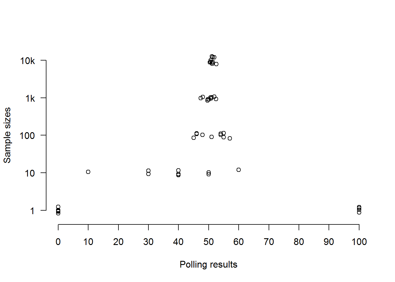
Note how the results of polls converge more and more tightly, the larger the samples are. With very small samples, the results are all over the place — not because the sample is too small in relation to the total population, but because when you’re only dealing with ten, or even a hundred randomly-chosen individuals, it makes a big difference which ten or hundred individuals you randomly chose almost regardless of how big the total population is (I say ‘almost’ because if the population is so small that a sample of ten or a hundred is the majority or even the whole of it, then obviously this won’t apply). This point is easiest to understand with the extreme case we started off with, where we had a sample of just one, and the predicted result could only ever be a 100% victory for whichever party that single individual happened to support. Unless that one individual is the entire electorate, such a prediction cannot be treated as reliable.
Because the outcome of a poll with a sample of one will be as random as the sampling process, we should have no confidence in it whatsoever. And we should have little more confidence in a sample of ten, as we can see from the results above, which are all over the place. Even if the population is only a hundred, you’re not going to learn much by sampling ten individuals at random, because the answer you get will depend entirely on who those ten individuals happen to be.
But the outcomes of the various polls are starting to converge once we move to samples of a hundred, and by the time we’re looking at samples of a thousand, they’ve formed a fairly coherent mass. This is because, once we have a sample of a thousand, it no longer makes quite such a difference which thousand individuals we picked, because — provided that we really did pick them at random and didn’t e.g. choose a thousand people who all had something in common or were connected to one another in some way — they tend to disappear into a crowd that looks increasingly like a miniature representation of the population as a whole, regardless of how big that population happens to be.
This is why we go from a gap of 12% between the highest and lowest polling results with samples of a hundred to a gap of 5.1% with samples of a thousand. As for the circles representing samples of ten thousand, they’re virtually on top of each other, though there’s still a degree of spread because it still makes some difference which ten thousand individuals we happened to sample.
Some difference. But not much.
The average of all ten polls with samples of ten thousand is 51.234%, which is very close to the Sensible Party’s real level of support. And in fact, the average of all ten with samples of a thousand is not far off at 50.17%, which still correctly predicts the winner.
Two problems remain with those thousand-individual samples, however. The first is that the average only just predicts the right outcome — this is a really tight race, but not that tight. Just a little more wrong, and we’d be in danger of calling it for the wrong party. The second problem is the outliers: the minority of polls that gave results very different from the average. When a poll comes in suggesting that the Sensible Party is only on 47.4% — the lowest level of support found by any of the ten polls with samples of a thousand — we can well imagine the supporters of the Silly Party beginning to celebrate their forthcoming victory and apparent lead of 5.2%. ‘It’s a swing! A swing!’ they might proclaim (they are the Silly Party after all). But it’s not a swing, it’s just what happens every now and then when you sample populations at random. Sometimes — and quite by chance — you get a sample that looks a little less like the population as a whole, and a little more like your ‘political’ friends on Facebook.

1.3 Sampling error
What we’ve been agonising over here is called ‘sampling error’: the sample’s unrepresentativeness of the population. Some random samples are more representative than others — simply by chance — but the larger a random sample is, the more representative it’s likely to be. If you look back at the stripchart, you’ll see this. A sample of one can’t be representative of a population of more than one unless everybody’s the same. The samples of ten are wildly different from each other because the chances of randomly choosing ten individuals that just happen to be representative of a larger group are quite low. But as the samples get bigger, they tend to look more like each other because they tend to look more like the populations from which they are taken. The chances of randomly choosing ten thousand individuals that are not somewhat representative of the group from which you chose them are really quite low. This is why sampling error tends to diminish as the sample size rises — though there comes a point at which the gains to be had from increasing the sample size still further are too small to justify the expense (and you might be better off saving your resources for another poll at a later date).
Because this is a simulation and we know the true characteristics of the population as a whole, we can measure sampling error. In reality, we couldn’t do this, because the characteristics of the population as a whole are exactly what we would be trying to find out through sampling (and even the election we’re trying to predict won’t tell us what they were, because not everybody votes in elections). The following chart shows the average discrepancy between the percentage of Sensible Party supporters in Population A and the percentage of Sensible Party supporters in a sample, for each sample size:
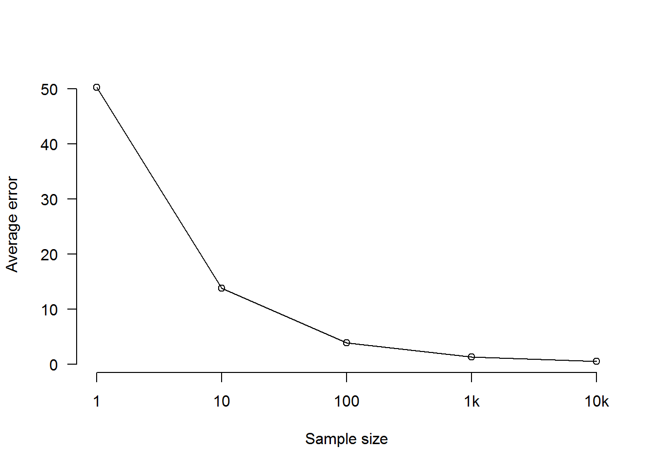
As we see, average sampling error declines as we increase the size of the sample, falling as low as 1.31% for the thousand-person sample and 0.48% for the ten-thousand-person sample. Again, this has nothing to do with the size of the population: it’s just that the more people there are in your random sample, the less difference the specific selection of individuals in that sample is likely to make.
1.4 Sample size versus population size: a red herring
Perhaps some readers are wondering whether what matters here is the proportion of the total population: whether a sample of a thousand from a population of a million is good because a thousand is 0.1% of a million, say, and whether a sample of ten thousand from a population of a million is better than a sample of a thousand because a thousand is 1% of a million. To explain why this is not the case, let’s see how accurate samples of the same sizes become when the population being sampled is ten million.
Population C breaks for the Sensible Party by exactly the same percentage as Population A, but is ten times the size. Again, we do ten polls for each of our sample sizes, then plot the results and average errors as before. Samples of a thousand will amount to 0.01% of a total population of ten million, so we might perhaps expect them to represent Population C as inaccurately as samples of a hundred represented Population A. However, that’s not how things work out:
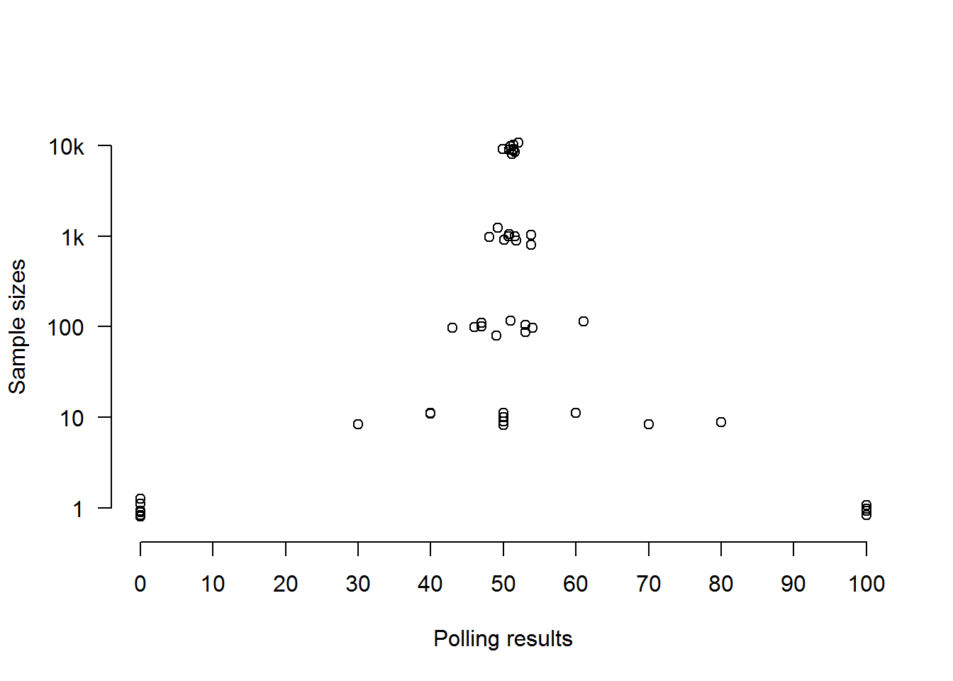

As we see, the overall picture for each sample size is basically the same as it was when we were taking samples from the much smaller Population A. Regardless of whether we’re sampling a population of a million or of ten million, a random sample of a thousand is good and a random sample of ten thousand is better (but not much better). An average error of just 1.31% (which is what we got with a sample of a thousand from a population of a million) or 1.49% (which is what we got with a sample of a thousand from a population of ten million) is really not bad at all.
The aim in polling is not to study some particular percentage of a population but to study a sample that can be assumed to have roughly the same characteristics as the population. If we choose each member of the sample at random, and we choose a thousand or more of them, then that assumption is relatively safe.
1.5 Wrong answers
But now let’s ask a different question: not how close the polls were to the reporting the correct percentages but how often they called the right result, i.e. a victory for the Sensible Party. If we ask that question of our polls of Population A, the picture looks rather different:
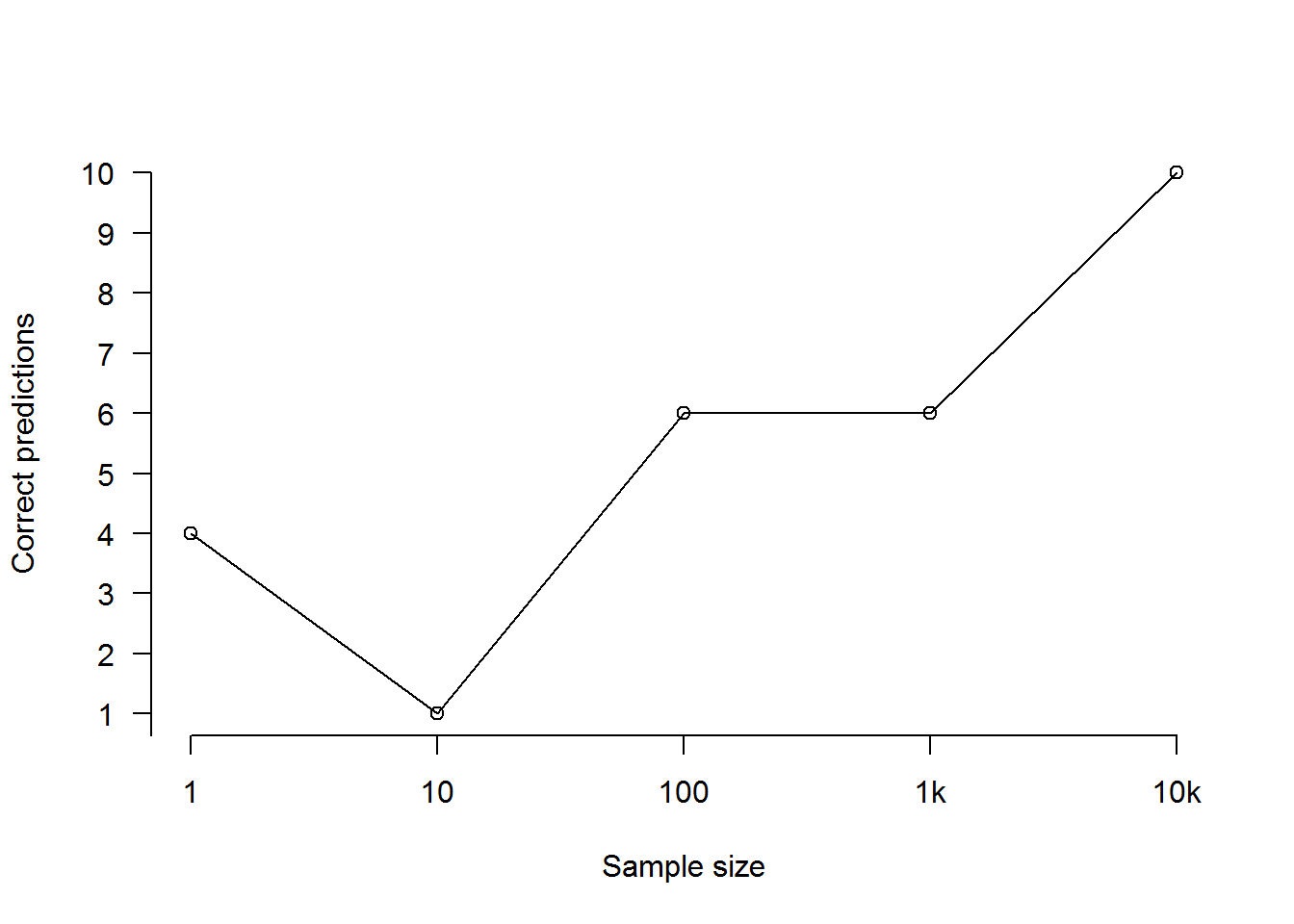
As we can see from the above, despite the rapidly rising accuracy of the polls, there’s no substantial increase in correctly called elections until we get to a sample size of ten thousand. How can this be?
Even when you’ve got the average error down to a mere 1.31%, you can’t reliably call the election if you only need to be wrong about 1% of the electorate to be wrong about which party is ahead. This means that, when it came to predicting the outcome of the election (as opposed to the approximate number of votes received by each party), all of the polls we carried out were basically shooting in the dark — until we pushed the sample size up to ten thousand. To clarify, that’s not because of how big the total population is, but because of how small the gap between the two parties is.

So does this mean that random samples of a thousand are useless? Not at all. It just means that if a poll using such a sample seems to be telling you that one party is 1% ahead, then what it’s really telling you is that it was 1% ahead in the sample, and therefore the election is probably too close to call because opinion in the wider population could very easily be different from opinion in the sample by at least that much. The usual way that pollsters warn you about this is by saying that the difference is ‘within the margin of error’ for the sample size. For a sample of a thousand, the margin of error is usually reckoned to be about 3%. This means that, whatever the poll has estimated the support for each party to be, there is only a 1 in 20 chance that sampling error has put that estimate out by more than 3%.
If what you want to know is roughly how much support each party has, then an estimate with a 3% margin of error at 95% confidence is very useful — especially if you have other recent estimates to compare it to. On the other hand, if all you care about is which party will win, and one poll is all you’ve got, and the two parties have almost equal levels of support, then you might as well toss a coin.
What if the polls are telling you that one candidate is ahead by much more than the margin of error? That’s another story entirely. We’ll now repeat the simulation for Population B, leaving out all the figures and visualisations except for the number of correct predictions of the overall outcome. As you may remember, 70% of Population B were Sensible Party supporters, while just 30% wanted to vote for the Silly Party:

That looks much better, doesn’t it? It would be utterly extraordinary for a majority of members of a random sample of any reasonable size to support a party that was supported only by a minority of the population being sampled when the real gap in support was this much greater than the margin of error. And the chances of that happening in successive polls with reasonably-sized samples are so tiny that we can just forget about them.
1.6 In the real world
In the real world, polling isn’t quite so straightforward. The above simulation assumes that we can just get hold of the preferences of individual members of a population. In the real world, we’d probably have to call them on the phone. Many people don’t pick up the phone, or refuse to participate in polls because they’re used to getting cold calls from scammers. Those that do pick up the phone and agree to participate may turn out to be unrepresentative of the population as a whole. Moreover, they — just like any other members of the electorate — may not have made their minds up about which way they’re going to vote, or they may be absolutely certain that they’re going to vote in some particular way and then end up not voting at all. Furthermore, people may support one party but vote for another party for tactical reasons. Added to all this, we have the problem that public opinion is a moving target, such that it may be impossible to tell whether a particularly high or low result is an outlier or the indication of a genuine swing — at least until we’ve done a few more polls to check.
All of this means that there is a great deal of uncertainty above and beyond the uncertainty that comes from using a random sample that may — entirely through the laws of chance — have given you an unrepresentative snapshot of the population. It’s only the latter uncertainty that is covered by the pollster’s ‘margin of error’. There are methodologies for dealing with the range of uncertainties at play, but it’s hard to give an estimate of their reliability. Some uncertainties are easier to deal with: for example, we know that older people are more likely to vote than younger people, so we can choose to weight their opinions more heavily. But what are you going to do with the ‘don’t knows’? You could ignore them — but they may turn out to be important. Or you could force them to make their minds up on the spot when you interview them — but they may make their minds up differently when they find themselves putting real crosses on real ballot papers. All of this makes exact prediction very difficult.
2 But but but…
If you’ve ever had an argument with a British poll sceptic, you’ve probably heard something like the following:
- If polls are so accurate, why is Donald Trump in the White House?
- If polls are so accurate, why isn’t Ed Milliband at 10 Downing Street?
- If polls are so accurate, why is Britain leaving the E.U.?
I’ve heard these objections repeatedly over the last few months, so I’ll address them all now.
2.1 If polls are so accurate, why is Donald Trump in the White House?
National opinion polls in the U.S. predicted that Hillary Clinton would win the vote — but she went on to lose the election. Doesn’t this show that polls are useless?
No. National opinion polls predicted that Clinton would win a majority of votes across the nation, and that’s exactly what happened. Trump is president because winning a U.S. presidential election is not about winning a majority of votes across the nation but about winning majorities of votes in a majority of states. If support for each party were evenly distributed across the nation, that would mean more or less the same thing. But it isn’t, and never has been. To predict the U.S. electoral college, which Trump won (as opposed to the popular vote, which Clinton won), you would have to do separate polls in every state. There was some state-level polling before the election, but not enough to spot that postindustrial ‘rust belt’ states that had voted for Barack Obama were going to flip for Trump.
Pollsters face a similar situation in a British general election, where what counts is not the number of votes but the number of seats in the House of Commons, and where each seat is decided in one of 650 separate — but simultaneous — elections. This gives a distinct advantage to parties whose support is concentrated in specific geographical areas. For example, in the 2015 General Election, the Scottish National Party (whose support is concentrated in Scotland) won 8.6% of seats with only 4.7% of the vote, while the Liberal Democrats (whose support is distributed throughout Scotland and England) won just 1% of seats with 7.9% of the vote. One can model general elections by assuming that a national swing will be mirrored in every constituency, but things are unlikely to work out exactly like that in practice.
2.2 If polls are so accurate, why isn’t Ed Miliband at 10 Downing Street?
In 2015, polls led many British pundits to expect a coalition government led by Ed Miliband; instead, the U.K. got a majority government led by David Cameron, the incumbent Prime Minister.
Before we ask how this happened, we need to remember exactly what the polls had led the pundits to expect. It wasn’t that Miliband’s Labour Party would win the election. It was that it would lose it by a sufficiently small margin to facilitate the formation of a coalition government with the Scottish National Party. And we should also remember what really did happen. It wasn’t that Cameron’s Conservative Party won by a convincing margin. It was that it won a bare majority of seats and was just about able to form a government without reviving its coalition with the Liberal Democrats. So yes, the pollsters got it wrong, but they didn’t get it as wildly wrong as some now seem to remember. Their mistake was to overestimate the size of the Labour vote by about 3% and to underestimate the size of the Conservative vote by about 4%.
The polling industry did not write off the discrepancy between the way in which its samples had told it they would vote and the way in which the electorate actually voted. Instead of making excuses or moving cheerily onto the next thing as if nothing had gone wrong, the British Polling Council and the Market Research Society commissioned an independent investigation chaired by Prof. Patrick Sturgis of Southampton University. Conspiracy theorists take note: this was done because the industry regarded its polling as a failure and didn’t want to fail again. If pollsters were in the business of repeating their clients’ prejudices back at them, they wouldn’t have bothered with any investigation — much less an independent one.
The investigation concluded that the most likely explanation of what happened was that the individuals polled had not been entirely representative of the voting population as a whole. With the exception of YouGov (which conducts its polls online), pollsters tend to sample the electorate either by dialing telephone numbers at random or by randomly choosing individuals or households from consumer databases that may have contained disproportionate numbers of households from particular demographic groups. Sturgis and colleagues found that ‘[n]o within-household selection procedures were used, and samples were not weighted to take account of variable selection probabilities’, such that the resulting samples ‘will have suffered under- and over-representation of some sub-groups (e.g. under-representation of individuals with access to mobiles but not to landlines) because initial selection probabilities were not fully controlled’ (2016, p. 26) Moreover, insufficient account was taken of the demographic groups to which sampled voters belonged:
It is… in principle, possible to weight [stated voting intentions] to the population of [each category of] voters directly rather than to the general population… However, it would still be necessary to combine this weight with a model for turnout probabilities and, in practice, this would be difficult as there is no obvious source of information on the profile of the voter population. Moreover, none of the pollsters took this approach in 2015, to our knowledge. (Sturgis et al, 2016, p. 23)
Difficult but not impossible — as we shall see, something very like Sturgis and colleagues’ recommended analytic methodology was adopted by one pollster in attempting to predict the results of the E.U. membership referendum. But this takes us back to the difference between polling and prediction on the basis of polls. And whatever the reason for the discrepancy between the polls and the vote, the lesson is clear: not that whatever the pollsters say must be wrong in exactly the way that you want it to be, but that unless your party is consistently ahead by a wide margin, you should definitely not assume that it has a reasonable chance of ending up in power.
2.3 If polls are so accurate, why is Britain leaving the E.U.?
In the months leading up to the referendum on Britain’s membership of the European Union, polls showed support for the Leave camp rising while support for the Remain camp fell. In the two weeks leading up to the vote, 15 opinion polls put Leave ahead, while 12 put Remain ahead. In the actual referendum on 23 June, a very slender majority of voters opted for Leave. This could have been presented as a success for the polling industry, but came as a surprise because four of the six polls published the day before the referendum had put Remain ahead rather than Leave. The trend had been from Remain to Leave, reaching a peak in mid-June, after which the Leavers’ lead started to diminish. This last-minute flurry of polls, with four calling it for Remain and two for Leave, dragged the rolling average back to a 2% lead for Remain and persuaded many smart people to believe that the swing had come right back the other way and Britain was going to stay in the European Union.3
It may be that this was just sampling error of the sort that we saw in our simulation. When levels of support for two choices are only very slightly apart, many polls will put the wrong one ahead even under the ideal circumstances represented by the simulation above. That four out of six polls published on one particular day put the losing camp ahead does not seem particularly noteworthy when it is recalled that fifteen out of twenty-seven put it behind in the two-week period that concluded on that day.
It is, however, also possible that there really was — at that time — a very slight and temporary lead for Remain, followed by another swing back to Leave that came too late for the pollsters to detect (the polls were published the day before the referendum, but had been conducted earlier). Half of the six polls that appeared on the eve of the referendum reported that 11% of those polled were still undecided, which would have been enough to turn a 2% lead for Remain into a 4% lead for Leave if two thirds of those that made their minds up at the last minute made their minds up to get Britain out.
That said, it is conceivable that we may be able to do better than simply counting up polls, or taking an average of the percentages they report — at least if we have sufficient time, data, resources, and expertise. Benjamin Lauderdale of the London School of Economics and Political Science and Prof. Douglas Rivers of Stanford University (YouGov’s Chief Scientist) developed a sophisticated approach to prediction, which was adopted as the official YouGov Referendum Model. Instead of treating the electorate as a single population, they divided it up according to demographic features such as age, gender, and level of education, as well as by past voting behaviour. They used the 2011 census to establish how large each group was as a proportion of the electorate as a whole, used multiple YouGov polls to estimate the proportion of each group that intended to vote for Leave or Remain (taking account of when the polls had been conducted), and used the 2015 British Election Study to estimate the proportion of each group that would actually vote. These were the conclusions of their analysis, published two days before the referendum itself:
Our current headline estimate of the result of the referendum is that Leave will win 51 per cent of the vote. This is close enough that we cannot be very confident of the election result: the model puts a 95% chance of a result between 48 and 53, although this only captures some forms of uncertainty. (Lauderdale and Rivers, 2016)
Maybe Lauderdale and Rivers were just lucky, but — as estimates go — that one’s really not bad. Nonetheless, it didn’t get anything like so much attention as the polls that various pollsters (including YouGov itself) published the following day, two thirds of which put what turned out to be the wrong camp ahead.
3 Fallible but informative
Polling relies on samples that can never be entirely representative, so when two parties are running more-or-less neck-and-neck in terms of public support, it may be impossible to figure out which one is really ahead (or will be in the actual vote). On the other hand, polls can give us a good idea of whether parties really are running roughly neck-and-neck — and that’s very useful information in its own right. They can also tell us whether there are substantial numbers of undecided voters, which is also good to know — even if they can’t magically tell us what decision those undecided voters are going to make. And the Brexit-predicting success of Lauderdale and Rivers’s YouGov Referendum Model suggests that, even under such circumstances, it may be possible to crunch away the problems if we have sufficient data with which to enrich the available polls — though we might want to see more than one correct prediction before accepting that.
Although the failures of polling or prediction discussed above were taken seriously by the industry, they give no grounds for hope that a clear majority of polls indicating a clear lead for one side will lead to more votes for the other. Such hopes are nothing but wishful thinking on the part of the soon-to-be-beaten. When one party, candidate, or referendum choice has a clear lead in a clear majority of polls, that’s probably how things are in the wider population — and the apparent losers should think long and hard about where they might have gone wrong.
This is exactly what the polls have been showing in the U.K. for most of the last year and a half, but not everyone on the losing side is prepared to admit that a major change of course might be necessary.
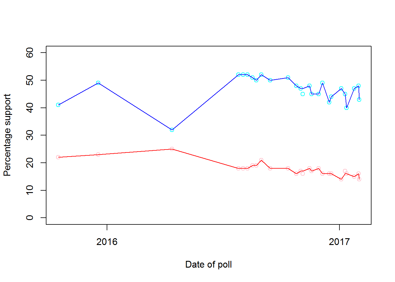
Only three polls have put the Labour Party ahead of the Conservative Party since Jeremy Corbyn was elected Labour leader in 2015 — and all of them were conducted between mid-March and late April 2016. Even during that period — the dizzy height of Labour’s popularity under Corbyn — about three times as many polls put the Conservatives ahead, all by 3-5%, while the tiny handful of polls putting Labour in front gave it a lead of only 1-3%. The following month, Labour’s fragile standing in the polls began gently to collapse, and the Scottish Parliamentary elections saw Labour fall to third place behind not only the pro-independence Scottish Nationalists but also the pro-unionist Conservative Party. In the simultaneous round of local elections across Britain, Labour made a net loss of eighteen seats. Since that time, Labour’s support has been in steady and uninterrupted decline, with most recent polls giving the Tories a lead of 14% or more. (Neither the referendum in June nor the so-called ‘coup’ in July had any discernable impact on the party’s standing in the polls: the unusual closeness of Labour and the Conservatives in June was caused by a decline in support for the Conservatives rather than a rise in support for Labour, and disappeared when Cameron’s replacement by Theresa May gave the Conservatives a boost.)
Polls asking about preferred leader rather than preferred party and offering only two alternatives paint an even starker picture, and suggest that Corbyn may be substantially less popular even than the party he leads. No such poll has ever shown a lead for Corbyn over the Conservative leader of the day, nor even put the two in a tie — and even in mid-April 2016, when Corbyn was at his most popular and the then leader of the Conservatives, David Cameron, was polling badly by his own standards, Cameron still had a 7% lead. Although the Labour leadership challenge appears to have given a brief boost to Corbyn’s popularity, with three polls in the second half of August 2016 showing him to be the preferred choice of 19-21% of the electorate, his support began to drain away once he was re-elected as leader, coming in at 18% in September, 16-18% in October and November, 16% all through December, and 14-17% in January and February. May’s popularity has also declined over the same period, but at the same approximate rate, so that the gap between the two has remained roughly constant. Only one poll since Corbyn took charge of the Labour Party — back in mid-April, when Cameron was still Prime Minister — has found the Tory leader to have the support of less than 40% of its sample. The chart below shows the popularity of Corbyn (red) and his opposite number in the Conservative Party (blue) in all such polls since he became leader.4
Recent experience shows that the polls may very well be wrong, but that they are very unlikely to wrong so consistently, or by so much.
With thanks to Siobhan McAndrew for comments on the first draft. All errors are mine alone. I stole the photographs.
-
In defence of the scholar in question, I should point out that the kinds of lexicographic questions he is famous for addressing require a different approach. If you want to know how the word ‘Trotskyist’ tends to be used, for example, then a sample consisting of a thousand words of ordinary speech would be pathetically inadequate because that particular word probably wouldn’t come up even once. But if you want to know what the general public thinks of your favourite left-wing politician, then a sample consisting of a thousand people chosen at random is probably plenty. The bulk of this essay is devoted to explaining why that is.↩
-
All illustrations used in this essay (apart from the charts, obviously!) are screenshots from the 1970 Monty Python sketch, ‘Election Night Special’ (Chapman et al, 1970). I have no rights to them whatsoever and will remove them if the rightsholders ask. But do go and watch the original. It’s free.↩
-
See the Financial Times’s Brexit poll tracker.↩
-
There’s a Wikipedia page that archives opinion polls aiming to predict the next U.K. general election. The version of the page available at the time of writing is archived here.↩
4 References
Chapman, G., Cleese, J., Gilliam, T., Idle, E., Jones, T., and Palin, M. (1970). ‘Election Night Special’. BBC Television, 3 November. Available at: https://www.youtube.com/watch?v=kJVROcKFnBQ
Lauderdale, B. and Rivers, D. (2016). ‘Introducing the YouGov Referendum Model’. YouGov, 21 June. Available at: https://yougov.co.uk/news/2016/06/21/yougov-referendum-model/
Sturgis, P., Baker, N., Callegaro, M., Fisher, S., Green, J., Jennings, W., Kuha, J., Lauderdale, B., and Smith, P. (2016). Report of the Inquiry into the 2015 British general election opinion polls. National Centre for Research Methods. Available at: http://eprints.ncrm.ac.uk/3789/1/Report_final_revised.pdf.