Labour’s performance in recent by-elections has been — shall we say — a little weak. As Glen O’Hara (2017) observes, ‘[g]overnments have increased their by-election vote share only seven times since 1970’, but two of those occasions were last month, which was ‘the first time the Government has seen its vote rise in two simultaneous by-elections since 1954’. Who is to blame? Some point the finger at Neil Kinnock and Tony Blair for selling out the interests of the working classes — as supposedly represented by the party’s ‘hard left’ wing, until recently led by the late Tony Benn — and chasing the middle class vote instead. But this version of events rests on a misunderstanding of the Labour vote: Theo Bertram’s (2017) analysis shows that the Labour Party has only won General Elections when the proportion of skilled workers voting Labour rose and the proportion of skilled workers voting Conservative fell (yes, this happened under Blair; the opposite happened under Corbyn).
Bertram’s much smarter than me, but his argument is based on opinion polls, which not everybody appears to respect. For that reason, I thought I’d create some charts showing shares of the actual vote in strongly working class constituencies. Hmm, how about Copeland (formerly, Whitehaven) and Stoke-on-Trent Central?
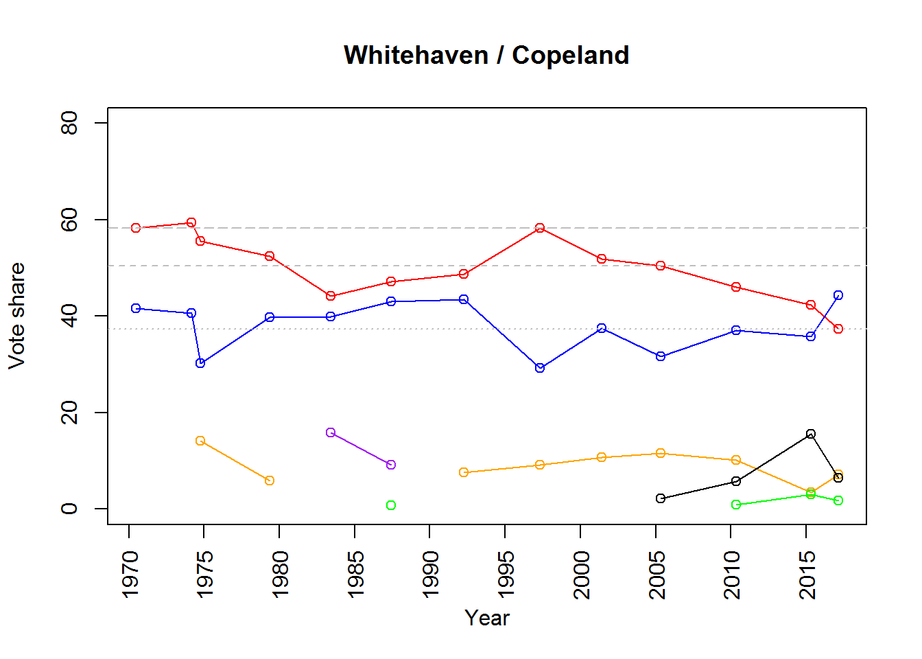
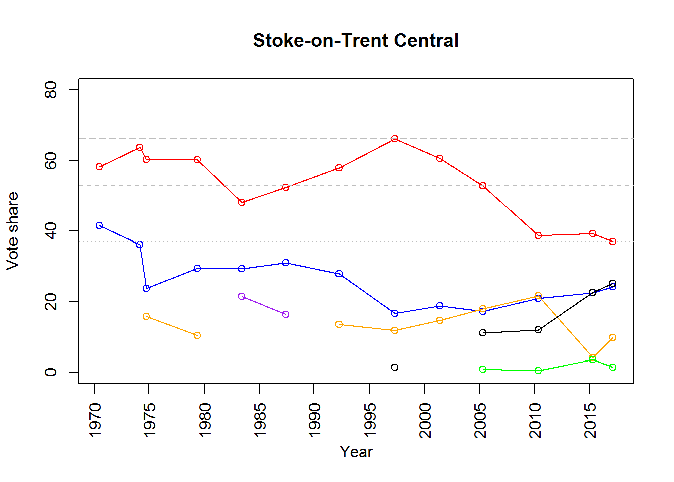
As you might guess, the red line represents the Labour vote, the blue line represents the Conservative vote, the orange line represents the Liberal or (later) Liberal Democrat vote, and the purple line represents the Social Democrat vote. To simplify matters, the green line represents the combined vote share of the three other left-of-centre parties that fielded candidates in one or both of these two constituencies during the time period in question, while the black line represents the combined vote share of the two other right-of-centre parties that did likewise, i.e. the very right-wing UKIP and the very, very right-wing BNP. The three grey horizontal lines on each chart are to help compare vote shares over time: the line of long dashes shows the highest vote share achieved by a Labour candidate under Tony Blair, the line of short dashes shows the lowest vote share achieved by a Labour candidate under Tony Blair, and the dotted line shows the vote share achieved by Labour last month.1
Don’t lose sight of those horizontal lines while looking at the zigzags. There’s a tendency to look at graphs like this and say, ‘Well, it’s all downhill from 1997, so that’s when the rot set in.’ Vote share usually declines under a sitting Prime Minister: it did under Clement Attlee, for example, and, apart from him and Blair, no other Labour Prime Minister has ever been re-elected after a full term in government without an intervening period in opposition. The horizontal lines help us to focus on the ranges within which vote share has fallen.
I’d suggest looking at the two charts for a while to let it all sink in. But here’s the key thing: whatever votes were lost in Copeland and Stoke under Tony Blair were votes gained under him. Under both him and Neil Kinnock, Labour candidates were more popular than they were under the left wing Michael Foot (when Tony Benn’s influence was at its height) – and under Jeremy Corbyn, they were less popular than under anybody else, including the famously unpopular Gordon Brown as well as Michael Foot. During Blair’s tenure, Labour’s vote share returned to and remained at about the level it had held in the 1970s when it was led by Harold Wilson and Jim Callaghan. Since Blair left office, Labour’s share of the vote has fallen well below that level, and the combined share of the vote held by parties of the political right has gone up and up. This has continued under Corbyn in both Copeland and Stoke-on-Trent Central, the latter being held by Labour only because the right-wing vote was split between the UKIP and Conservative candidates (in fact, the Labour vote there was even lower than it was in Copeland).
If we look at the numbers themselves, the point becomes clearer. Each of the following tables compares the Labour candidate’s average vote share and average lead over the Conservative candidate throughout the 1970s, under Michael Foot (1983), under Blair (1997-2005), and under Corbyn (2017):
| Lab. vote share | Lab. lead over Con. | |
|---|---|---|
| 1970-1979 | 56.4 | 18.4 |
| 1983 | 44.2 | 4.3 |
| 1997-2005 | 53.5 | 20.7 |
| 2017 | 37.3 | -7.0 |
| Lab. vote share | Lab. lead over Con. | |
|---|---|---|
| 1970-1979 | 60.7 | 27.9 |
| 1983 | 48.1 | 18.7 |
| 1997-2005 | 59.9 | 42.3 |
| 2017 | 37.1 | 12.8 |
In Whitehaven/Copeland, the Labour candidate’s average share of the vote under Blair was a little under 3% lower than it had been in the 1970s, but the Labour candidate’s average lead over the Conservative candidate was actually more than 2% greater. In Stoke-on-Trent Central, the Labour candidate’s average share of the vote under Blair was less than 1% lower than it had been in the 1970s, but the Labour candidate’s average lead over the Conservative candidate was over 14% greater. This means that in both of these strongly working class constituencies, Labour candidates were at least as popular under Blair as they were in the 1970s. And when we look at Labour candidates’ performance under the two most left-wing leaders, Foot and Corbyn, the numbers speak for themselves: by contrast both with the Blair era and the 1970s, they’re abysmal and they’re much worse under Corbyn than under Foot.
This does not support the narrative that Labour’s left wing attracts the working class vote while its centrist wing repels it. If anything, it suggests that the opposite is more likely to be the case — although the vote under Brown indicates that simply being a centrist is not enough. Moreover, if we return to the line charts above, we see that, in both constituencies, the remaining ‘left’ vote — which combines votes for Socialist Alternative, the Trade Unionist and Socialist Coalition (TUSC), and the Green Party (which received the bulk of this vote) — amounts to virtually nothing, and falls with the Labour vote under Corbyn, suggesting that the Green Party may have lost votes to Labour because Corbyn had moved his party into its territory, while former Labour voters were hoovered up by right-wing or centrist parties for the very same reason.
If it wishes, the Labour membership can pontificate on the evils of the ‘mainstream media’ (with optional reference to the works of Raymond Williams, Noam Chomsky, and Antonio Gramsci). And if it so desires, it can join I, Daniel Blake director and Left Unity party founder, Ken Loach in constructing theories as to why the working class should have chosen to punish Labour’s centrist wing by withholding from Jeremy Corbyn the votes it once gave to Tony Blair (see Loach 2017). But if it indeed hungers for a genuine ‘alternative’, then it should face up to the evidence that working class voters have little enthusiasm either for the Labour Left or for parties to the left of Labour. It’s not really surprising when you think about it. Few who are struggling to pay the rent or to feed their families in the here and now will pin their hopes on a promised future overthrow of capitalism. And no one in their right mind would want to be poor Daniel Blake.
It has become a cliché to say that Labour’s problems go beyond Corbyn. Of course they do. It’s clear that something new was needed in 2010, and that Gordon Brown’s Labour Party wasn’t it: in both Copeland and Stoke, Labour’s vote share fell far below its lowest point under Blair. And it’s just as clear that something new was still needed in 2015, when Ed Miliband’s Labour Party wasn’t quite it either: Labour’s share of the vote in Stoke-on-Trent Central rose only a little above the level it had held under Brown, while in Copeland, it continued to fall. After Miliband stepped down, the need for something new was clearer than ever, but what the party tried was a return to 1983 — and this time around, the results were even worse:
Working class voters looked at Corbyn and made up their minds in the first two months. … [I]n September 2015, 32% of C2DEs had no opinion on whether Corbyn was doing a good or bad job. Only 30% thought he was doing a bad job. By November 2015, only 14% didn’t know. 63% thought he was doing a bad job.
Bertram (2017)
Okay, okay — so Bertram’s using opinion polling data, which opinion polls tell us many Corbyn supporters don’t believe in (although they should). But the two charts above show actual votes. If you lose vote share in a constituency like Stoke-on-Trent or Copeland, and it’s either a general election or a by-election where you’re not the party of government (because the government almost always loses vote share in by-elections), then that’s a pretty clear signal that you may have a problem with working class voters. Just like it’s a pretty clear signal that you may have a problem with middle class voters if you lose vote share in a constituency like — I don’t know, like Richmond Park, say. Somebody remind me what happened in Richmond Park.
If Labour Party members really want the working class vote back, then — sooner or later — they’re going to have to admit that putting people like Jeremy Corbyn in charge may not be the way to go about it.
- If you want them, you can download the figures for Whitehaven/Copeland and Stoke-on-Trent Central in the form of tab-separated tables.↩
References
Bertram, T. 2017. “The Copeland Test: Labour’s Core Vote.” @theobertram, February. https://medium.com/@theobertram/the-copeland-test-labours-core-vote-ddac4fb8ee#.m816jo8ju.
Loach, K. 2017. “Don’t Blame Corbyn for the Sins of Blair, Brown, and New Labour.” Guardian, February. https://www.theguardian.com/commentisfree/2017/feb/28/dont-blame-corbyn-sins-blair-brown-new-labour.
O’Hara, G. 2017. “What Is the Meaning of Copeland and Stoke?” Public Policy Past, February. http://publicpolicypast.blogspot.co.uk/2017/02/what-is-meaning-of-copeland-and-stoke.html.